Project
Forms Charts
The project’s focus was to reimagine how Formstack Forms delivers charts, insights, and analytics. The introduction of stacked graphs into the workflow enables users to compare data and visualize the relationships between fields.
Client: Formstack
Interview
Users and Subject Matter Experts
I start a project by conducting interviews with users, potential users, and subject matter experts. It is important to validate designs and conduct usability tests throughout the project timeline, not just at the beginning or end. A quick ten-minute interview with Ben Novak, a Business Intelligence Consultant who handles data analysis on a daily basis, revealed the following insights: 1) It’s important to not only understand the problem but also the surrounding context, 2) Each analysis is unique because no two problems are the same, and 3) Data analysis often results in further analysis.
From interviewing the subject matter expert, I created a list of six user interview questions. I purposefully kept the list short in order to optimize for time. Users are more likely to volunteer 15 minutes of their day rather than 30 minutes. Because Formstack’s customers solve for different problems, it’s important to conduct at least ten users interviews. The variety of use cases present different pain points.

“I like to communicate important information by telling a story. I like to explain the world that existed before... then describe how this new information impacts the current situation.”
Research
Brand Identity and Analytics
During the research phase, I familiarized myself with the Formstack application and the company as a whole. Studying the Formstack Brand Manual was a meaningful step in the process. Understanding the brand and content guidelines ensured that my designs embodied the company’s goals and values.
Though I have previous experience with designing dashboards, I wanted to stay current on best practices for dashboard design. I found two particularly helpful articles which are linked below. Research provides me with creative inspirations on how to design interactions that have a familiar yet novel feel.
Formstack Brand Manual: https://www.formstack.com/brand
10 Rules for Better Dashboard Design: https://uxplanet.org/10-rules-for-better-dashboard-design-ef68189d734c
30 Handpicked Excellent Dashboards: https://medium.muz.li/30-handpicked-excellent-dashboards-347e2407a057

Workflow
As a last step of the research phase, I signed up for a trial account and created my own form. Going through the process as a new user put me in the customer’s shoes. I created a workflow of the current chart functionality, then I brainstormed ways to make the user experience more efficient.
The proposed workflow includes simple updates. I didn’t want to stray too far from the current functionality and risk alienating existing users. I simplified the workflow to include an immediate call to action on the Charts page. I also added the flexibility to create a chart from individual field’s results or find relationships between fields.
Process
Rapid Prototyping with Inspect Mode
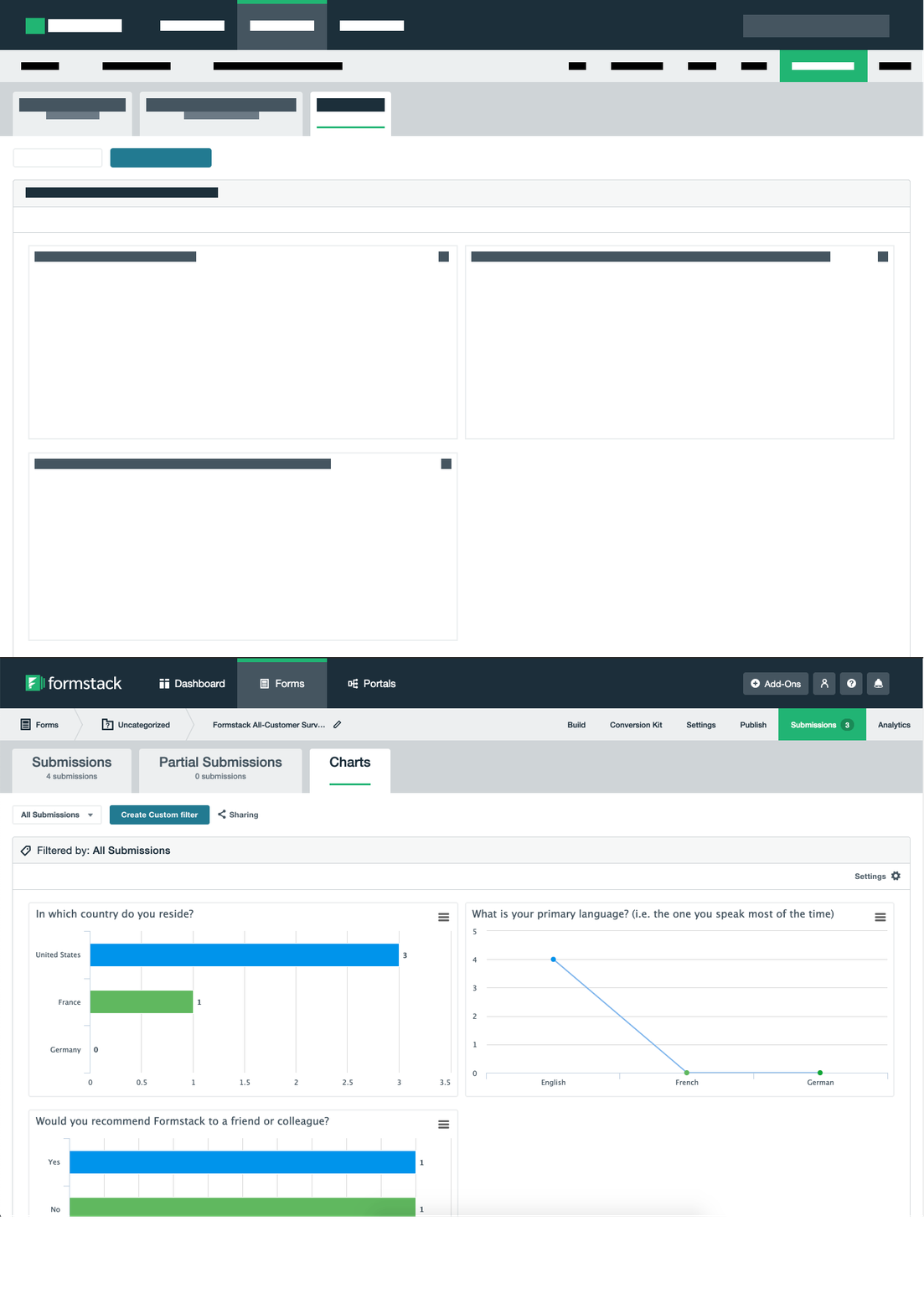
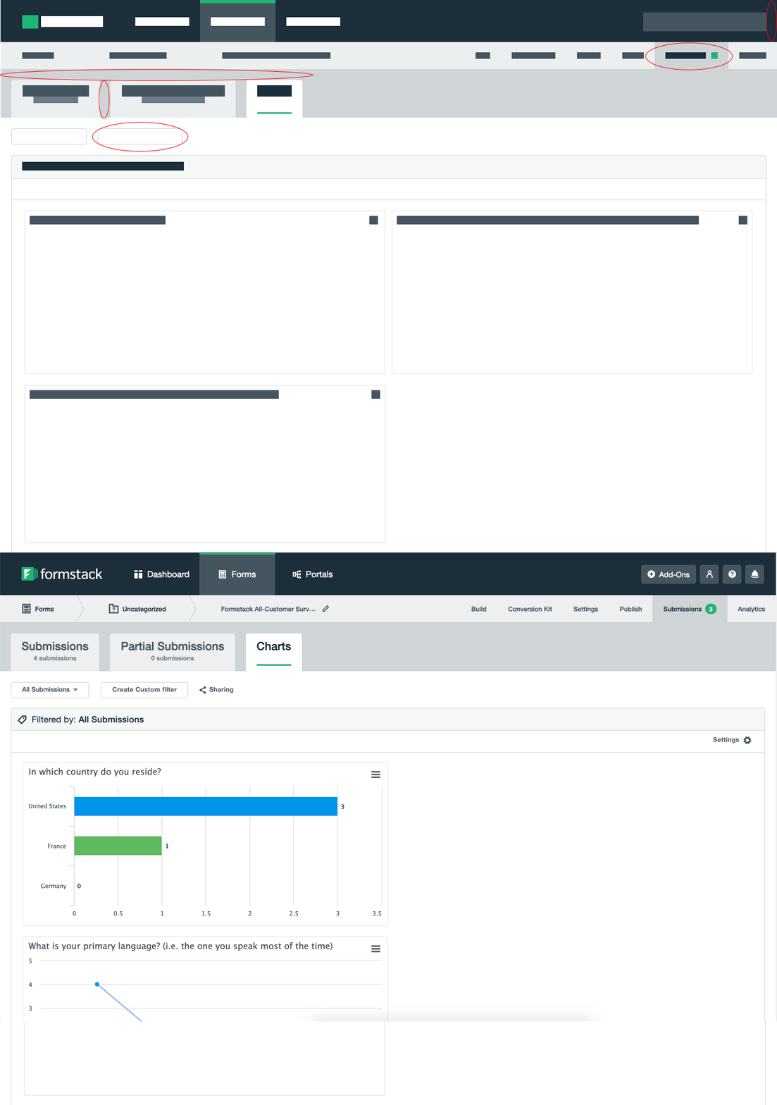
Due to time constraints with the project timeline, I opted to focus on small but meaningful changes in the user interface. I used Inspect Mode to alter the HTML and CSS on the page, making improvements to the header and spacing. This rapid prototyping technique allowed me to explore user interface changes in real time. After making improvements, I was able to screenshot the header and reuse it on Sketch, saving myself plenty of time and effort from recreating reusable parts of the interface.

Blockframing
The technique of blockframing allows a designer to assess the harmony of a screen. Blocking out the text and images on the Charts page allowed me to focus on color usage and spacing, regardless of the content. To the left is the page before and to right is the page after some HTML and CSS hacking. The minor improvements that I made focused on page spacing and removing large blocks of color in the header. The blocks of color drew the users’ attention away from the charts which are the most important parts of the page.
Process
Sketch High Fidelity Wireframes

Grid System
My first step in prototyping is to create a grid. The grid system drives component placement on the page. Screen sizes may vary, but I typically divide the area into twelve columns with consistent margins. Using twelve columns is very flexible because they can be combined to create two, three, four, or six column grids.
Visualization Options
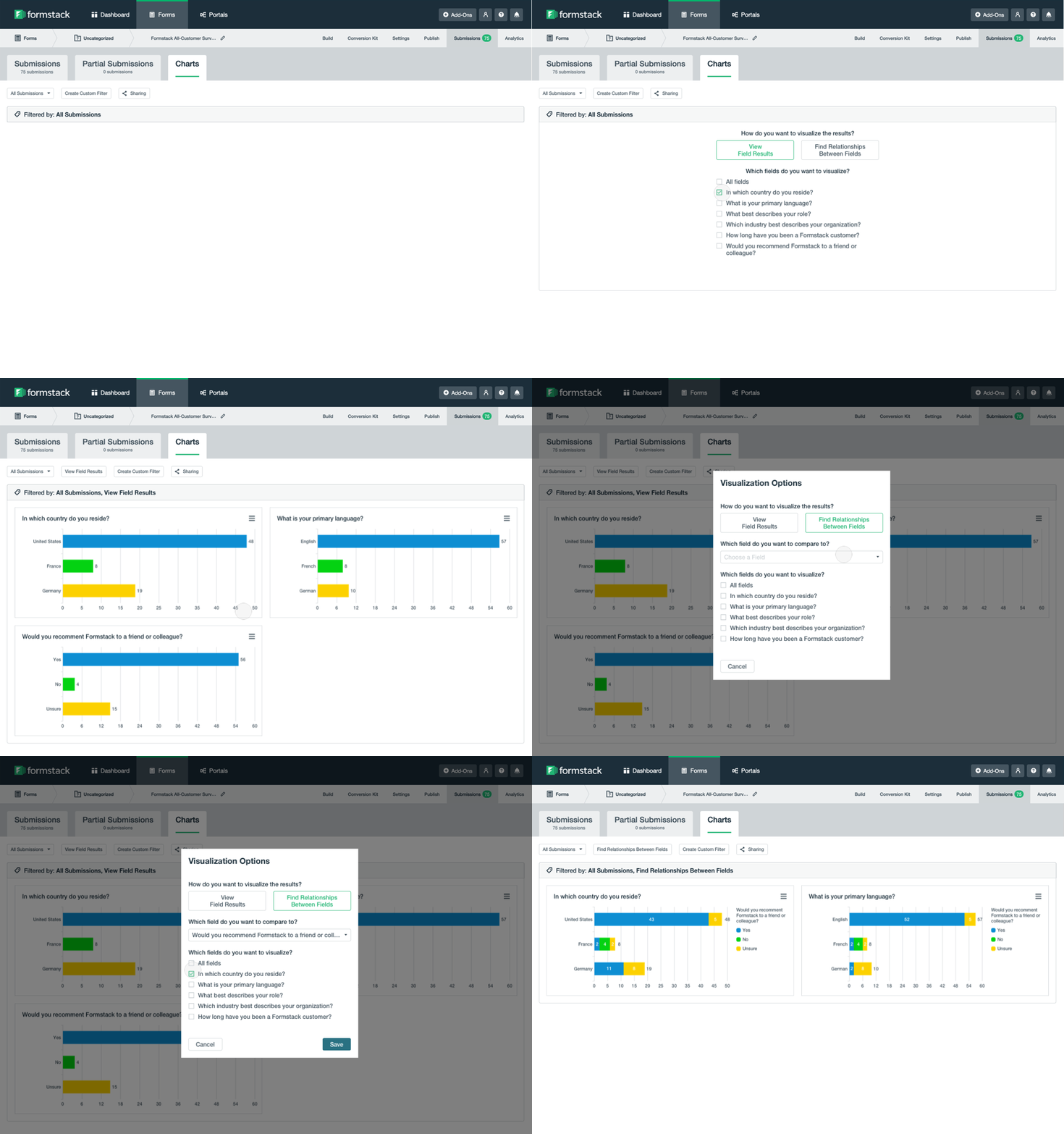
Currently, when a user first visits the Charts page for a survey, the screen is empty. Without any cues, users must know that they have to click on the Options icon. The user flow isn’t immediately obvious. The absence of charts may lead to confusion because their mental models aren’t being reflected by the user interface.
I improved the user experience by presenting an option on the screen when they visit the Charts tab for the first time. This creates an immediate call to action and guides users towards their objective.
Stacked Graph
Stacked graphs allows users to find relationships between fields, leading to better insights. When viewing field results individually, users could come to the conclusion that four customers wouldn’t recommend the product and fifteen customers are unsure they would recommend. However, these results don’t equip the user with any tools to solve this problem. By using stacked graphs and comparing field results, users could see that there is a higher ratio of “unsure they would recommend” and “wouldn’t recommend” in non-native English speaking countries. Because every survey is unique, this provides flexibility for users to analyze results in a way that fits their needs.
u
Process
Invision Interactive Wireframes


Process
Principle App Animations
As a final step, I used Principle App to bring the project together by adding realistic animations. This helps communicate to Frontend Developers how the elements on the page are going to interact with each other.

Conclusion
Further Analysis
These simple workflow and feature changes result in more analytical flexibility for the user. The Formstack application provides the analytical tools to deliver insights for today and inspire new questions to be tackled tomorrow.


